In today’s educational landscape, there’s a strong emphasis placed on developing a student-centered curriculum. However, teacher training programs often overlook how to design student-centered materials, such as slides, assignments, and rubrics. As a result, many educators (understandably) rely on traditional methods they were exposed to while coming through the education system. However, as more districts embrace 1:1 technology, it’s essential that educators recognize how to optimize the design of their materials for students in the digital age.
Enter user interface/user experience (UI/UX) design. UI/UX design focuses on making digital products easy, intuitive, and enjoyable for users (in our case students). Though our understanding of how learners engage with information in digital environments is evolving alongside new technologies, there are several established findings that educators can leverage to ensure the efficacy of their instructional materials as they migrate from paper to screen.
![]()
1 Reduce Friction
As attention spans contract, it’s imperative that students find the digital materials they’re looking for quickly. The more clicks it takes to access necessary information, the easier it is for one to throw in the towel and exclaim, “I can’t find it.” Thus, consider how you can reduce friction for students by creating more direct pathways to assignments, resources, etc.
Objective: Share an article for students to read during class.
Don’t: Post a file path on the screen (Justice Unit > Resources > Readings > “Justice in the 21st Century” article).
Do: Create a QR code (for iPads) or shorten the URL (for laptops) and project it.
Objective: Post learning materials for the week.
Don’t: Create and label a new folder in your learning management system (Google Classroom, Schoology, etc.) and fill it with a series of cascading sub-folders for assignments, readings, etc.
Do: Create a calendar using Google Slides; link any assignments, readings, etc.; and post due dates for the week. Embed the slide (or a link to the slide) at the top of your learning management system. Add a new slide for each week so students can clack back to previous weeks for materials they may have missed while absent.
![]()
Objective: Encourage students to refer to previously shared resources while working on an assignment.
Don’t: Assume they will know where to locate a mini-lesson/tutorial/resource you previously shared.
Do: Create hyperlinks in the assignment that take students directly to the resources you want them to reference while working on the task. This allows students to place an assignment and reference materials side-by-side on their digital devices for quick reference as they work.
2 Write for Screens
No, students don’t read like they used to. But that’s because their lives are filled with screens, not printed materials. Studies show that reading digitally leads to an increase of skimming, due to a combination of digital distractions, browsing features, visual layouts, and searchability inherent in devices. Therefore, breaking text into smaller, more digestible chunks with an established hierarchy will lead to increased reading on the part of learners.
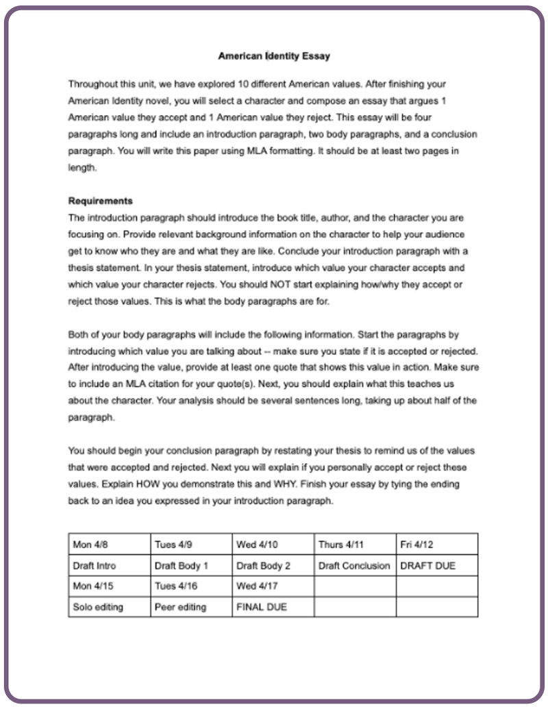
Objective: Create an assignment sheet for an upcoming essay
Don’t: Fill the page with several lengthy paragraphs
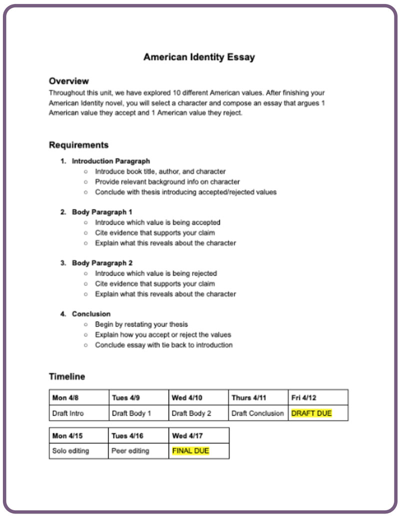
Do: Chunk your writing into shorter paragraphs of 3-5 sentences. This will prevent wandering eyes and temper temptations to click or scroll elsewhere.
Don’t: Use the same font size/weight across the document.
Do: Create visual hierarchy by incorporating headings and subheadings in larger/bold fonts to guide readers to the information they seek. This will guide students to the information they’re looking for as they scroll through the document.
Don’t: Forego using bullet points
Do: Embrace bullet points and attempt to keep them equal in length. Longer bullet points are often skimmed over for those that are more uniform.
Before Utilizing UI/UX

After Utilizing UI/UX

3 Design Inclusively
We design our curriculum to be inclusive for a variety of learners, but we must also be inclusive when digitally designing our assignments, resources, etc. The practice of universal design refers to designing products, environments, and systems to be usable by people of all ages, abilities, and backgrounds, without the need for adaptation or specialized design. Much like a blind student needs materials printed in braille, consider how other groups of learners could be impacted by the design of your teaching materials.
Objective: Creating a slideshow presentation
Don’t: Use colored text on a colored background.
Do: Stick to a white background and a dark font (black, navy blue, or dark gray) to ensure colorblind students can decipher the content. If you insist on incorporating more color, use an accessibility checker to ensure there is enough contrast between your background and text for all readers
Objective: Creating a group activity during which students of different reading abilities will assume different roles — facilitator, note taker, etc.
Don’t: Describe the roles exclusively with text
Do: Utilize icons or emojis that help capture each role, so English language learners are confidently able to understand their role even if the language is unfamiliar.
![]()
Objective: Creating a formal writing assignment for students
Don’t: Start from scratch and add requirements to the page as they come to you
Do: Create a template and follow it for each formal writing assignment. Knowing where to consistently find information creates a more predictable environment for students with autism spectrum disorder who thrive with routines and predictability.
Educators already juggle a heavy workload. Therefore, I don’t recommend trying to embrace all of these UI/UX design best practices at once. Consider gradually incorporating one new strategy each month until your digital material design is as student-centered as your curriculum. Additionally, educators can teach principles of UI/UX design to students and require them to utilize them for presentations, projects, etc. — after all, these skills will only become more critical as the world continues to digitize. Furthermore, other school professionals, such as librarians, can also incorporate these principles into newsletters, displays, and signage. By focusing on reducing friction, writing for screens, and designing inclusively, educators have the ability to better leverage the power of technology to increase their students’ outcomes and prepare them for future success.


